
Your church may already have a website, but is it doing everything it can to engage your members and boost fundraising?
A strong church website can help inform your congregation about upcoming events, allow new members to learn more about your church’s identity, and increase fundraising results. In fact, churches that accept tithing online may grow their overall donations by 32 percent. This boost in funding can be used toward your operating expenses, hosting community engagement events, providing educational programs, and more.
Use these essential design elements in your website to enhance your digital presence and bring in even more support for your mission:
- Logo
- Visuals
- Fonts
- Strong Website Template
To streamline your web design efforts, work with a content management system (CMS) with features that will benefit your church. According to Morweb, a comprehensive website builder can help your organization add in and arrange content with ease without having to dive into the technical backend of your site. Armed with a user-friendly CMS, you’ll be well-prepared to add your design elements to your site. Let’s begin!
Logo
Your church’s logo is a memorable design that should appear across your marketing materials, from your church’s flyers to your website. Placing a recognizable logo on your web pages, including your donation page, allows site visitors to feel confident that they’re giving to your church.
Kwala’s guide to logo design recommends following these essential tips:
- Make it mission-centric. Review your church’s mission and values and try to infuse this into your design through the use of symbols and images. For example, you might consider using visuals typically associated with churches, such as a dove to represent peace or a cross to encompass your church’s faith.
- Choose the right color palette. Different colors have different connotations, so it’s important that you use a color scheme that speaks to your values and how you want church members to view your organization. For example, the color red is often associated with love and sacrifice, the color blue is often associated with calmness and trustworthiness, and the color white is often associated with righteousness and holiness. Make sure the colors you select work well together to create a cohesive design.
- Keep it simple. A straightforward design is much easier than a busy design to remember and avoids visually overwhelming your viewers. Avoid trying to fit too many elements into your design. Instead, opt for a clean, polished look that is unique and representative of your organization.
Your logo should stand the test of time and be useful for your organization 10, 20, or 30 years down the line, so create a timeless design that captivates your congregation. Once you’ve come up with a winning design, feature it prominently across your site. Many of the best nonprofit and church websites include their logo in the upper left corner so it’s easy to see.
Visuals
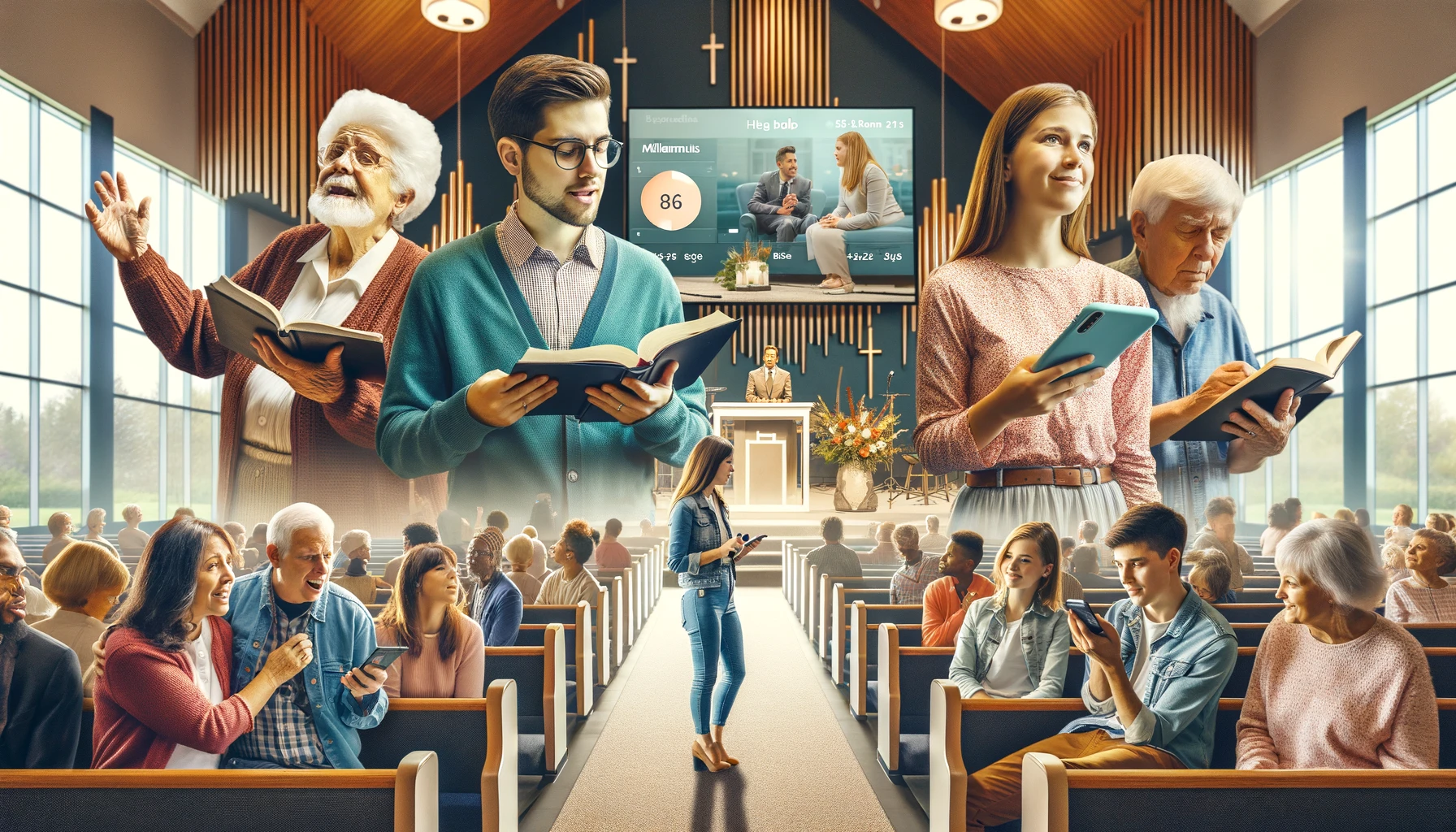
Visuals, like graphic designs, photos, and videos, can help take your website to the next level and effectively grab your audience’s attention. Consider adding the following powerful visuals across your website:
- Photos of your church’s community and staff. Share headshots of your church’s leaders, photos at your latest events and youth programs, and pictures from special events like baptisms and weddings. This can help humanize your organization and allow prospective members to get a better sense of what it’s like to be a part of your church.
- Videos of your church in action. Develop a video that captures your church’s community by featuring testimonials from existing members, or create a video that features highlights from your last community-building event. You can also livestream your worship services and share these feeds on your website. This allows existing members to take part virtually as well as gives prospective members an idea of what your services are like.
- Graphic designs that highlight your church’s impact. If your church is very involved in charity, you might create an infographic that brings attention to your impact. For example, a church with a food pantry might share an infographic that spotlights how many warm meals they provided and people they fed in a year. This can help encourage church members to donate by letting them know exactly how their contributions make a difference.
Visuals can also help to break up long blocks of text. Place your visuals strategically throughout your website to illuminate your content and keep your site visitors actively engaged.
Fonts
Along with captivating visuals, it’s equally important to consider your fonts. Using the right font can make reading your content a more enjoyable experience, allowing readers to focus on your messaging instead of getting distracted by overwhelming or busy typography. When incorporating font designs into your website, consider the following tips:
- Use a sans serif font. Sans serif fonts like Helvetica and Arial are easy to read and are often associated with modernity and simplicity, communicating a professional feeling on your website.
- Use the right font size. The body content on your website should be about 16-18 pixels on a desktop screen, and 14-16 pixels on mobile devices. Your headings should be slightly larger, so aim for your H1 headings (main title) to be 24-30 pixels and your H2 headings (subheadings) to be 18-24 pixels on a desktop screen. The right website builder will automatically optimize your website for mobile so your web content will appear appropriately sized to mobile visitors.
- Incorporate an accessibility widget. An accessibility widget will allow your site visitors to adjust your content to their preferences by changing the font type or size. This makes your content more inclusive for a diverse audience, giving your church a boost in reputation and allowing people of all abilities to engage with your content. Look for a website builder that comes with this key accessibility tool and more to ensure your website is compliant with the Americans with Disabilities Act (ADA).
Ensure that the font style you choose is appropriate for your website’s overall style and tone. For example, a more playful font could be useful for creating a welcoming and family-friendly appeal, while a traditional font conveys professionalism and directness. Experiment with different font types and decide which one makes the most sense for your brand.
Strong website template
A website template can help your organization streamline its design and add in its content with ease. Rather than having to decide where you’ll arrange your text, images, and overall layout for each webpage, work with a website builder that offers ready-to-go website templates. Then, you can adjust these elements as needed to fit your church’s unique brand.
While there are many free, open-source website builders out there that offer an array of templates like WordPress or Drupal, using these templates will often require technical knowledge and a reliance on support from third-party service providers or online forums.
This means that if your church’s web design team runs into any questions, you won’t have a dedicated support team to reach and will have to tackle most issues you have on your own.
Instead, work with a proprietary CMS that comes with a full customer support team to answer any questions and walk you through how to leverage its website templates. A proprietary CMS is also more secure than an open-source platform, ensuring that your website’s data isn’t vulnerable to cyber attacks.
A well-designed website can transform your church’s digital presence, allowing you to engage with existing members and invite new people to join your congregation. Do your research to find a user-friendly website builder so you can streamline your design and have a beautiful site in no time.


Add Comment